


Doom: The Dark Ages (Does Not Have) A Colour Problem
I messed up.

So, despite being a menu afficionado that often spends the first hour or so of a game tinkering with HUD and graphics settings, I missed that DOOM: The Dark Ages lets you do exactly what I was asking for in the entire article written below. This entire piece is now useless, but I want to keep it up as a reminder to double and triple check things before putting them to writing.
For those who might’ve missed it like me, in the Game settings tab you can turn off Daze highlights (the purple ones) entirely and you can recolor the green parry light to whatever you want, with the game offering you the four RGBA sliders. Hat’s off to you IDTech, no one does it better.
I’ll be writing a piece praising The Dark Ages’ unmatched level of customization in multiple areas to make up for this one. This was the only quirk I had with the game, and It wasn’t actually real. Oof..
Sorry about this one, I promise I (usually) know what I’m writing about.
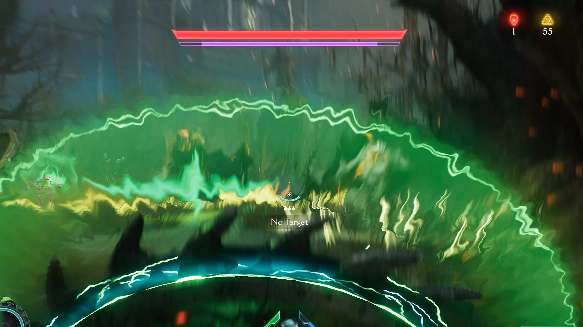
While most seem bothered by how much Doom: The Dark Ages changed from 2016 and Eternal, my irk is with what it should’ve changed, but didn’t. In a game that is as bleak as it can be, drowning in grey and brown tones, why are there flashing neon-like outlines and bright lasers constantly on screen?
Because Doom: The Dark Ages has a colour problem.
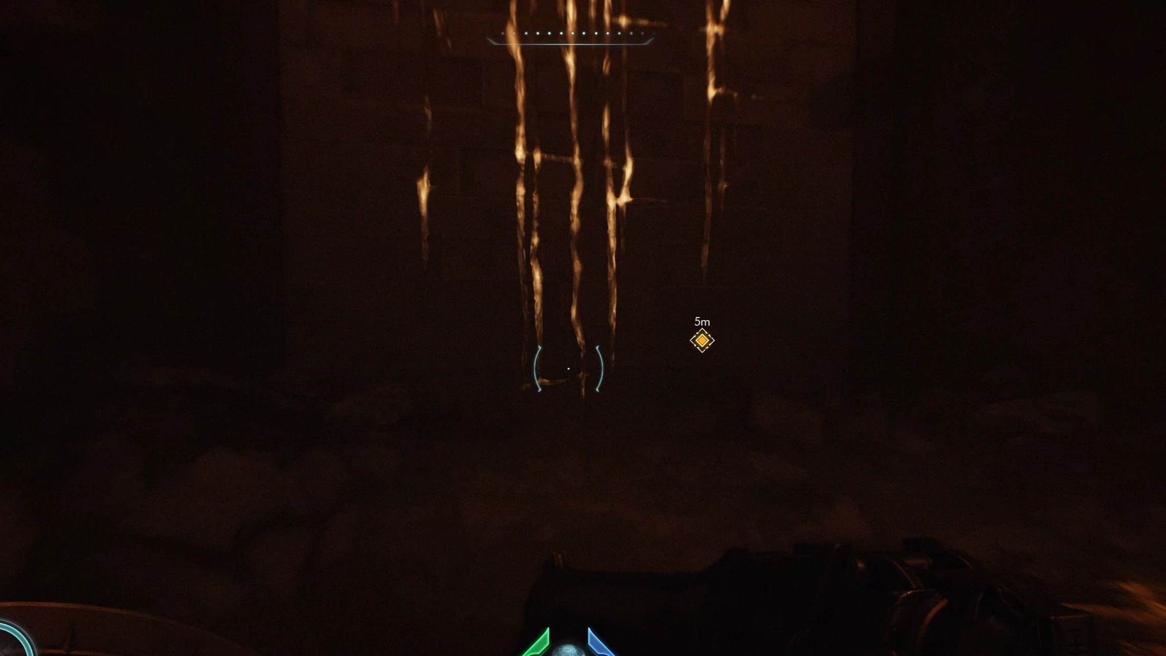
The most pertinent discourse surrounding colour in gaming is the infamous yellow paint. You’ve heard of it before, and you’ve certainly encountered it at least a dozen times. It is there to guide you through platforming sections or to point out which boxes are breakable, and it does so with the subtlety of a flashbang.
Thankfully, that isn’t a big issue in Doom: The Dark Ages. It is still present, but the devs did what they could to blend it decently into the environment, as evidenced below.
What is a big issue in this game is how out-of-place the gameplay-related colour choices look in a world that is consistently bleak and muted. The environment colours and the blood doesn’t pop like it did in Doom 2016, let alone in the ever-colourful Doom Eternal. Yet, the gameplay related colours seem to have time-travelled straight from Eternal into The Dark Ages.
I understand the role they have in how this Doom entry plays out. You’re meant to notice an executable demon, no matter how chaotic the battlefield might be at that time. And how would you notice parriable moves and projectiles in the midst of a huge horde if it didn’t stand out? All I want is choice.
Doom: The Dark Ages is an excellent display of IDTech’s technology and— now that most of the crashes and weird post-launch quirks have been ironed out— it is a fantastic product, especially on PC. Difficulty is deeply customisable, much like the game’s own graphics. So why can’t I customise and change the colour choices the devs made for these gameplay interactions?
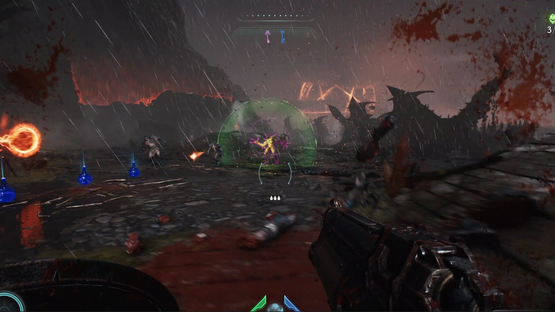
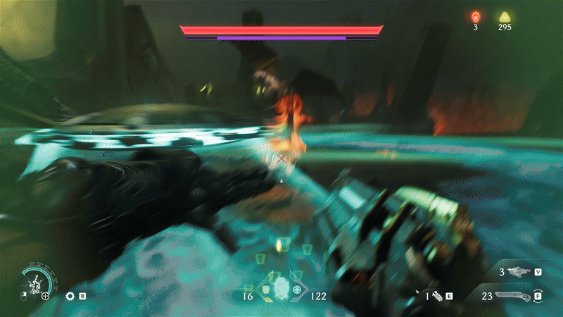
I know I’m likely in a minority that gets bothered by this, but for me a bright purple outline around an enemy that is seen through walls and dozens of other demons looks odd. It looks even weirder than the already bizarre bright neon-green projectiles telling you to pull your shield out for a parry. The sentiment’s the same when a huge spawn of hell is surrounded by enough green light to illuminate a whole disco when he is in the middle of a parriable melee strike.
Doom has never been an RPG or a game that asks you to be completely enveloped by the story, but it has always been a franchise that deeply immerses you in its experience. You put on a good pair of headphones or turn up your speakers, and you sit down to rip and tear for however much time you got free. The music is excellent, the sound design and mixing is up to par, and from the moment you sit down to the one in which you have to get up, you’re the Slayer.
I love The Dark Ages setting more than 2016’s and Eternals, so my suspension of disbelief helped me ignore the fact that there are spaceships and plasma rifles alongside plate armor and metal shields in a completely anachronistic setting. It is Doom, after all, it’s not supposed to make sense, it is supposed to be metal as hell. But I just can’t see past the purple outlines and the bright neon-green lights. It clouds my vision like the yellow that filled the Slayer’s own eyes while under the control of the Maykrs.
I’m not asking for much, almighty IDTech, all I want is a simple menu toggle that allows me to turn those colours into something more muted, or remove them all together, at my own risk. I want my Doom: The Dark Ages as dark as the name implies, but right now it has a colour problem.
You know what, good on you for owning and correcting. It’s a hard ask, and a good lesson. Very easy to miss things and form stories off an idea that isn’t quite right. And then hide it out of shame.
Last year I wrote that killing Concord early could be part of a comeback strategy for the game. With the info I had at the time, it wasn’t wrong.
But was later proved inaccurate. I corrected, and that’s all you can do.
I wouldn’t cross out your old copy. You correct it, so I know it’s wrong. But it’s actually made me more intrigued to read what you did say originally.
I just cannot get into these new Doom games. They are just so far removed for me from the original games.